Web design in 2026 is no longer about flashy visuals or trends that fade overnight. It’s about creating meaningful, usable, and memorable experiences for real people. Modern websites are expected to load fast, communicate clearly, and feel intuitive across every device. These evolving expectations are shaping how designers think, plan, and build digital spaces today. The web design trends of 2026 focus on clarity, accessibility, performance, and strong brand identity rather than decoration alone. Understanding these trends helps businesses create websites that users trust, enjoy, and return to while also staying competitive in search rankings and user experience standards.
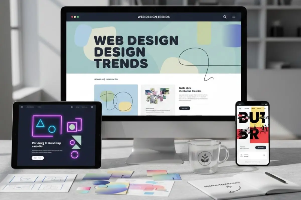
20 Web Design Trends Shaping 2026
Web design in 2026 is no longer about impressing users with flashy visuals. It’s about making things easier, faster, and more meaningful for the people who visit your website. Below are 20 carefully researched web design trends shaping how modern websites are built and experienced in 2026.
1. Purpose-Driven Minimalism
Minimalism in 2026 focuses on intentional simplicity, not empty layouts. The goal is to remove distractions while keeping everything users actually need.
Every design element must serve a clear purpose. Buttons guide actions, headings explain intent, and images support the message rather than decorate the page. When someone lands on your website, they should immediately understand what it offers and what to do next.
Purpose-driven minimalism helps users make decisions faster and feel less overwhelmed.
Why it works:
- Faster page load times
- Clearer user focus
- Higher
2. Bold Typography That Speaks for You
Typography has become one of the most powerful design tools in 2026. Fonts now express emotion, confidence, and brand personality.
Designers use bold headings, large font sizes, and thoughtful spacing to guide readers through content. Instead of relying on heavy visuals, typography creates impact on its own.
Strong typography improves readability and makes content easier to scan, especially on mobile devices.
Key characteristics:
- Oversized headlines
- High contrast between text and background
- Carefully paired fonts
3. Soft Gradients and Muted Color Palettes
Bright and aggressive colors are being replaced by soft gradients and muted tones. These colors feel calmer, more modern, and more trustworthy.
Muted palettes help content stand out without overwhelming the user. Soft gradients are often used in backgrounds or section dividers to add depth without distraction.
This color approach creates a premium look while improving visual comfort.
Benefits include:
- Reduced eye strain
- Improved readability
- A more human, refined feel
4. Micro-Interactions That Feel Natural
Micro-interactions are small design responses that react to user behavior. In 2026, they are subtle, smooth, and purposeful.
Examples include buttons responding to clicks, form fields validating input instantly, or small animations during loading. These interactions reassure users that their actions are being processed.
The focus is on restraint. Micro-interactions should support usability, not distract attention.
Common uses include:
- Hover effects
- Button feedback
- Scroll indicators
5. Scroll-Based Storytelling
Scrolling is now a storytelling tool rather than just navigation. Content appears gradually as users scroll, guiding them through a narrative.
This approach keeps users engaged longer and encourages them to explore the page fully. It works especially well for brand stories, landing pages, and educational content.
Scroll-based storytelling also improves engagement metrics like time on site.
Why it’s effective:
- Keeps users curious
- Improves content flow
- Supports SEO through engagement
6. Mobile-First Is No Longer Optional
Mobile-first design is the standard in 2026. Websites are designed for small screens first and then adapted for larger ones.
This ensures that essential content remains readable and accessible on smartphones. Navigation is built for thumbs, and layouts prioritize vertical scrolling.
If a website performs poorly on mobile, users will leave quickly.
Mobile-first focuses on:
- Thumb-friendly navigation
- Vertical layouts
- Faster load speeds
7. Dark Mode with Proper Contrast
Dark mode has evolved beyond simple black backgrounds. Designers now use soft dark shades combined with accent colors.
The emphasis is on readability and accessibility. Text contrast is carefully balanced so content remains easy to read for all users.
Dark mode also reduces eye strain, especially in low-light environments.
Key improvements include:
- Softer dark backgrounds
- Clear contrast ratios
- Accessible text colors
8. Accessibility-Focused Design
Accessibility is now an expectation, not an extra feature. Websites in 2026 are designed to be usable by everyone.
This includes people using screen readers, keyboard navigation, or high-contrast settings. Accessibility improves overall usability for all users, not just a few.
Search engines also favor accessible websites.
Accessibility includes:
- Clear font choices
- Proper heading structure
- Keyboard-friendly navigation
- Screen reader compatibility
9. Image-Light, Content-Heavy Pages
Websites are reducing heavy image usage and focusing more on clear, structured content.
Typography, icons, and spacing replace decorative visuals. This improves page speed and helps users scan information quickly.
Content-heavy pages also perform better in search results because they are easier for search engines to understand.
Why this works:
- Faster loading times
- Better readability
- Stronger SEO performance
10. Authentic Visuals Over Stock Photos
Generic stock photos no longer build trust. In 2026, users value authenticity.
Brands are using real photos, custom illustrations, and honest visuals that reflect their true identity. These visuals feel more relatable and credible.
Authenticity helps websites stand out and connect emotionally with users.
Preferred visuals include:
- Real team or workspace photos
- Custom illustrations
- Brand-specific graphics
11. Clear Visual Hierarchy
Visual hierarchy helps users understand information quickly without thinking too much.
A strong hierarchy clearly shows what the page is about, what matters most, and what action to take next. Designers use size, spacing, alignment, and contrast to guide attention.
This reduces confusion and improves usability.
Key elements include:
- Clear headings
- Logical content flow
- Strong contrast
12. Modular Design Systems
Modular design systems use reusable blocks to build websites.
These blocks can be rearranged or updated easily without breaking the design. This makes websites easier to maintain and scale over time.
Consistency across pages also improves brand recognition and user experience.
Benefits include:
- Faster updates
- Design consistency
- Long-term scalability
13. Reduced Animation, Better Performance
Too much animation slows websites and distracts users. In 2026, designers use fewer animations with clear intent.
Each animation supports usability, such as guiding attention or confirming actions. Performance always comes first.
Fast websites keep users engaged and reduce bounce rates.
Design focus includes:
- Purposeful motion
- Lightweight animations
- Performance optimization
14. Smart Use of White Space
White space helps content breathe. It separates sections, improves readability, and reduces mental effort.
Instead of filling every area, designers allow space around text and elements. This makes pages feel organized and easier to understand.
White space improves both visual appeal and usability.
Benefits include:
- Better readability
- Cleaner layouts
- Reduced visual clutter
15. Content-First Design Strategy
Content-first design means building layouts around real content instead of forcing text into templates.
This ensures messaging stays clear across all devices. It also helps search engines understand page structure and relevance.
Content-first design supports long-term SEO success.
Key advantages:
- Clear communication
- Better engagement
- Improved search visibility
16. Conversion-Focused Layouts
Every page should have a clear purpose, whether it’s signing up, buying, or contacting a business.
Layouts guide users naturally toward that goal using strategic placement of buttons, content, and spacing.
Conversion-focused design reduces friction and improves results.
Common goals include:
- Lead generation
- Sales
- User sign-ups
17. Horizontal Scrolling (Used Carefully)
Vertical scrolling remains dominant, but horizontal scrolling is used selectively.
It works best for portfolios, galleries, and storytelling sections. When used carefully, it feels modern without confusing users.
Overuse can harm usability, so restraint is essential.
Best use cases include:
- Visual portfolios
- Product showcases
- Story-driven layouts
18. Subtle Texture and Depth
Flat design is evolving with subtle depth. Designers add soft shadows, light overlays, and gentle textures.
These elements make interfaces feel more natural and visually interesting without clutter.
The goal is realism with restraint.
Design elements include:
- Light shadows
- Layered sections
- Soft textures
19. Faster Load Times as a Design Priority
Speed is now a design responsibility. Designers optimize images, fonts, and layouts from the beginning.
Fast-loading websites improve user satisfaction and search engine rankings. Performance directly impacts engagement and conversions.
Speed is no longer optional.
Optimization focuses on:
- Lightweight assets
- Efficient layouts
- Clean code structure
20. Brand Personality Through Design
In 2026, websites are expected to clearly reflect brand personality.
Colors, typography, spacing, and tone all communicate who you are. A consistent personality helps users remember your brand and trust it.
A strong brand presence creates long-term recognition.
Effective branding includes:
- Consistent visual language
- Clear tone of voice
- Authentic design choices
Web Design Trends That Faded in 2026
Not all past web design trends have stood the test of time. As user expectations, technology, and accessibility standards evolved, some popular approaches became less effective or even counterproductive. Understanding these fading trends helps designers focus on what truly works in 2026.
1. Overloaded Visual Designs
Websites filled with heavy graphics, layered backgrounds, and excessive decorative elements have lost relevance in 2026. While they once aimed to impress visually, they often distracted users from the main message and slowed loading speeds. Modern users prefer clarity over complexity, especially on mobile devices. Clean layouts now perform better for usability, engagement, and conversions.
2. Auto-Playing Videos and Sounds
Auto-playing videos and background sounds are widely seen as intrusive and disruptive. They create frustration, especially for mobile users and people browsing in quiet environments. In 2026, user-controlled media is the standard, allowing visitors to decide when and how they consume content. This shift improves accessibility, trust, and overall user comfort.
3. Generic Stock Photography
Overused stock images with staged expressions no longer feel authentic or trustworthy. Users can easily recognize these visuals, which weakens emotional connection and brand credibility. In 2026, brands focus on real photography, custom illustrations, or unique visual styles. Authentic visuals help websites stand out and feel more human.
4. Excessive Animations Everywhere
Applying animations to every scroll, hover, or transition has proven counterproductive. Too much motion distracts users and negatively affects performance, especially on slower devices. Designers now use animation sparingly and with intent. In 2026, motion supports usability rather than serving as decoration.
5. Desktop-First Design Approach
Designing primarily for desktop screens no longer aligns with user behavior. Most website traffic now comes from mobile devices, making desktop-first layouts ineffective. In 2026, mobile-first design ensures better readability, navigation, and performance across all screens. Desktop layouts are now an extension, not the starting point.
6. Low Contrast and Tiny Text
Minimalist design once encouraged small fonts and subtle color contrast. However, this approach created serious readability and accessibility issues. In 2026, clear typography and sufficient contrast are essential design standards. Websites now prioritize comfort, inclusivity, and long-term usability over aesthetic minimalism.
7. Flashy Intro Splash Screens
Splash screens and “enter site” pages add unnecessary friction to the user journey. They delay access to content and often increase bounce rates. Modern users expect instant information and fast interaction. As a result, splash screens have largely disappeared from professional websites in 2026.
8. Icon-Only Navigation Menus
Icon-only menus were once seen as minimal and stylish, but they often confused users. Without text labels, navigation becomes unclear and less accessible. In 2026, designers favor clarity over abstraction. Combining icons with labels improves usability, speed, and accessibility for all users.
9. One-Page Websites for Complex Content
One-page websites work for simple campaigns but struggle with complex content needs. They limit SEO potential, content organization, and scalability. In 2026, multi-page structures provide better navigation and search visibility. Complex businesses now require clearer content separation and hierarchy.
10. Trend-Only Design Without Purpose
Following design trends without understanding user needs has proven ineffective. Websites built only to look modern often fail to perform or convert. In 2026, every design decision is intentional and goal-driven. Purpose now matters more than appearance alone.
Wrapping Up
Web design in 2026 is about clarity, intention, and putting real users first. Instead of chasing visual noise, modern websites focus on usability, accessibility, speed, and meaningful storytelling. From purpose-driven minimalism and strong typography to performance-focused layouts and authentic branding, these shifts reflect how people actually use the web today. The most successful websites are not the loudest ones, but the ones that feel effortless to navigate and easy to trust. By understanding and applying these web design trends, businesses and creators can build digital experiences that are future-ready, search-friendly, and genuinely helpful. Staying aligned with these principles ensures your website remains relevant, engaging, and competitive well beyond 2026.